How Student Concentrations Are Changing at Harvard 2.0
Published October 24, 2020, Page Last Modified May 22, 2023
[Best viewed on desktop]
In 2017, Edith Herwitz and Dianne Lee wrote an article in the Crimson called “How Student Concentrations Are Changing at Harvard” (a). I really liked it! It’s also very accessible.
They analyzed 13 of the 50 concentrations offered by Harvard. But it was hard to visually compare the different concentration areas (Arts and Humanities, Engineering and Applied Sciences, Sciences, and Social Sciences).
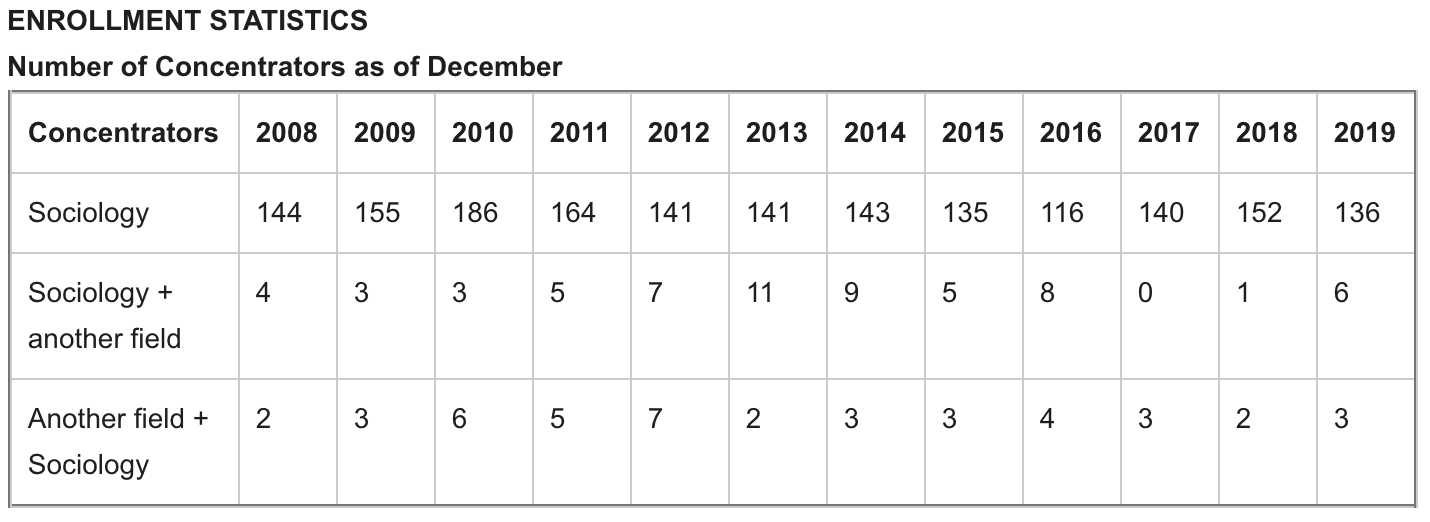
I scraped all available concentration data from the Harvard College Handbook to build a more full data visualization of student trends at Harvard from 2008-2019. It’s also interactive! You can find the raw data here. Color palettes were created using iWantHue.
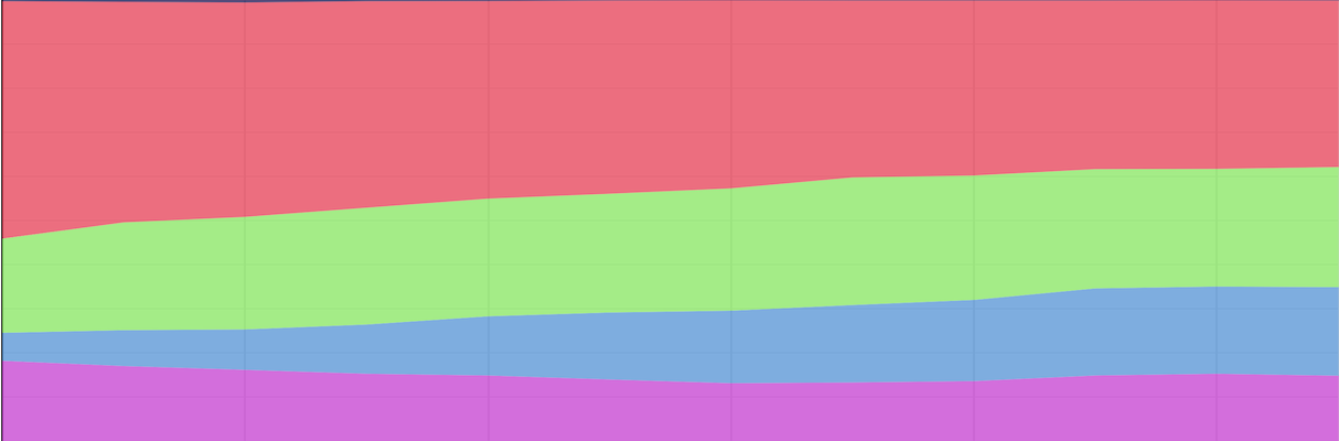
Some departments at Harvard offer joint concentrations. For these disciplines (like Sociology in the image below), I included both kinds of joint concentrators (where the department serves as the primary field or the allied field of the joint concentration).
Major Concentration Categories (2018-2019)
Sciences (2018-2019)
Engineering and Applied Sciences (2018-2019)
Arts and Humanities (2018-2019)
Citation
Subscribe
Comments powered by Talkyard.
Social Sciences (2018-2019)